Overview
The Cashflow and Networth Analysis Excel Workbook was designed to help you better understand your personal finances by providing detailed insights into your spending, income, assets, and liabilities over time, and by making your progress towards financial independence visible using powerful data visualizations.
The workbook was designed to integrate seamlessly with Tiller as an extension to the Tiller foundation template but it also functions as a standalone workbook for anyone who wants to import their data through other means.
The workbook was built without using any macros, scripts or VBA code. This decision was made for two main reasons: To make the spreadsheets more accessible to those who aren’t familiar with programming and VBA, and to meet the requirements outlined by the Tiller Community Builder Rewards Program.
Map
To help guide you through the numerous spreadsheets included in the workbook and their relationships, the following map was created:
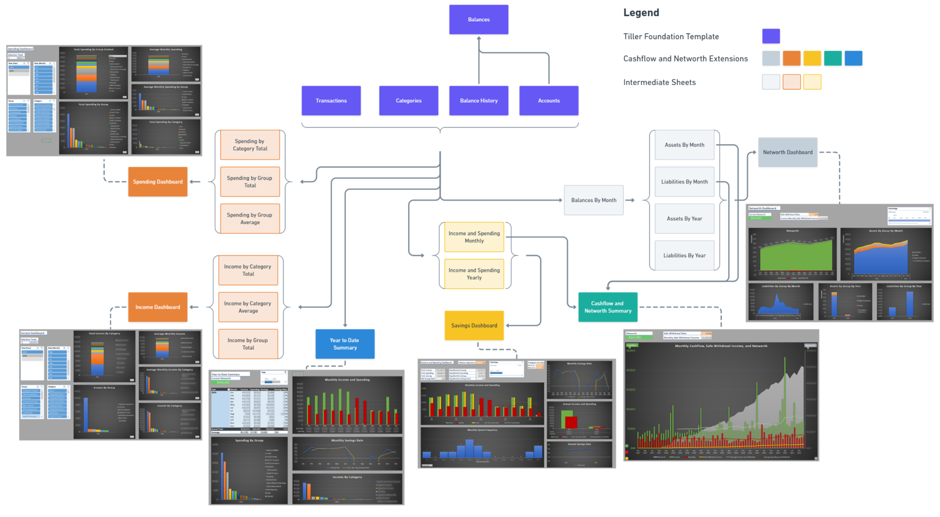
This map depicts the flow of data between spreadsheets (dependencies). At a high level, the data flows from the Foundation Sheets (Transactions, Categories, Balance History, Accounts, and Balances) to hidden Intermediate Sheets, and finally to dashboards that summarize the data and provide user controls to filter the data as required.
Intermediate Sheets such as Spending By Group Total transform the raw data present in the Foundation Sheets to prepare it for display in user friendly ways via the dashboards. For the most part, these sheets can remain hidden and ignored unless you want to dig deep into individual spending transactions or troubleshoot a dashboard issue.
The Settings sheet sits apart from this flow. This sheet allows you to configure global settings that shape what every dashboard displays.
Sheet Overview
Foundation Sheets
The Foundation Sheets are the core sheets that store your “fact” data (Transactions and Balance History) and “dimension” data (Categories, and Accounts). The Balances sheet functions as a dashboard but is also referenced by other dashboards.
Settings
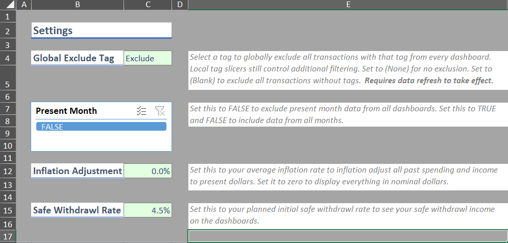
The Settings sheet is the workbook’s control panel. Use it to configure the following global settings:
| Setting | What it does |
|---|---|
| Global Exclude Tag | Excludes every transaction associated with the selected tag from all dashboards. See The Global Exclude Tag. |
| Present Month | Includes or excludes the current, partially complete month across every dashboard. The recommended setting is FALSE. See Excluding the Present Month. |
| Inflation Adjustment | Adjusts past income and spending to present day dollars for more accurate comparisons across large spans of time. Set it to zero to work in nominal dollars. |
| Safe Withdrawal Rate | Your planned initial withdrawal rate, used to plot safe withdrawal income on the Cashflow and Networth Summary Dashboard. Most people typically use 3-5%. |
The Global Exclude Tag and Inflation Adjustment settings only take effect after a data refresh (see Updating Data), because they feed calculations performed when your data is loaded rather than when the sheet is drawn. The Present Month and Safe Withdrawal Rate settings apply immediately.
Excluding the Present Month
The workbook was designed predominantly for reviewing your finances on a monthly basis. The current month is only ever partially complete, so including it makes charts misleading and quietly distorts your averages.
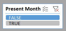
To exclude the present month, select FALSE. If you want to see all months including the present month, select both TRUE and FALSE.
This setting matters more than it appears on the Spending By Group Average and Income By Category Average sheets. Those averages divide your totals by the number of months that actually contain data, and a partially complete month still counts as a whole one. Review your spending on the 3rd of January with the present month included and your monthly averages will be dragged down by a month that’s only a tenth over. Leaving the present month excluded is the safer default.
Spending Dashboard and Income Dashboard
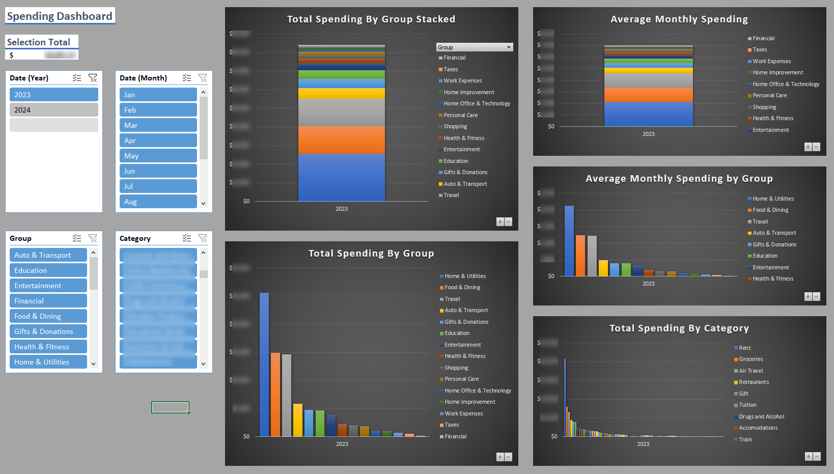
The Spending Dashboard and Income Dashboard allow you to analyze your spending and income over time by category and group. The dashboards and their Intermediate Sheets are practically identical save for the separation of income and spending transactions, and the increased focus on categories rather than groups for income (since most people will have considerably fewer income categories than spending categories).
Use the slicers on the left to filter the data by year, month, group, category, and tag as desired (see Tagging Transactions for what the Tags slicer does). Use the plus/minus buttons on each pivot chart to switch between aggregating the data monthly and yearly.
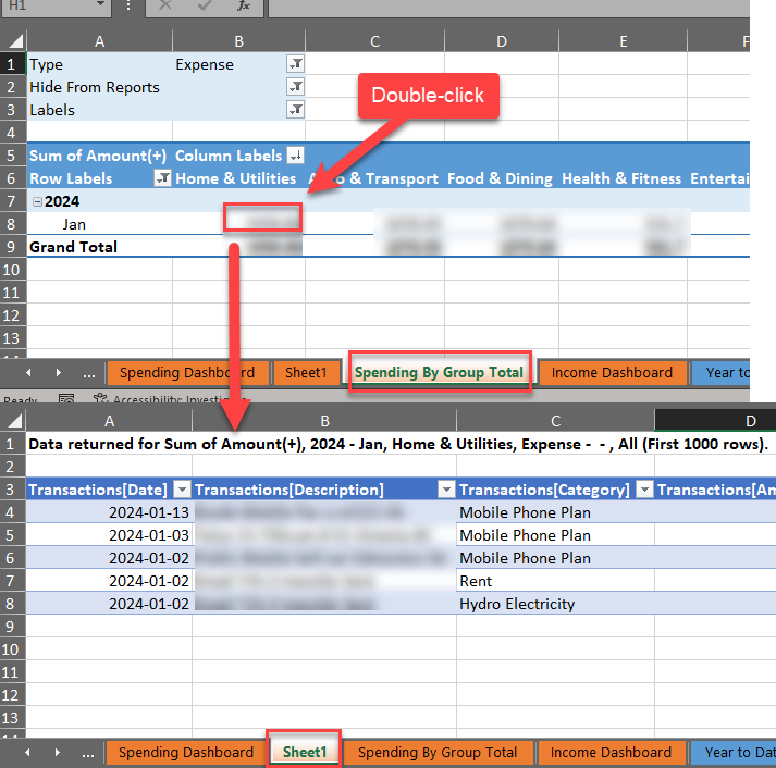
If you want to dig into the specific transactions that make up the current selection, unhide the Intermediate Sheet of interest (for example Spending By Group Total) and double-click on the pivot table cell of interest. This will generate a table of the transactions that make up that cell value as shown below. When you’re finished analyzing the transactions, delete the generated sheet (Sheet 1) and hide the Intermediate Sheet.
The Intermediate Sheets contain pivot tables summarizing the data in the following ways:
- Total by Category
- Total by Group
- Average by Group (spending) or Category (income)
Networth Dashboard
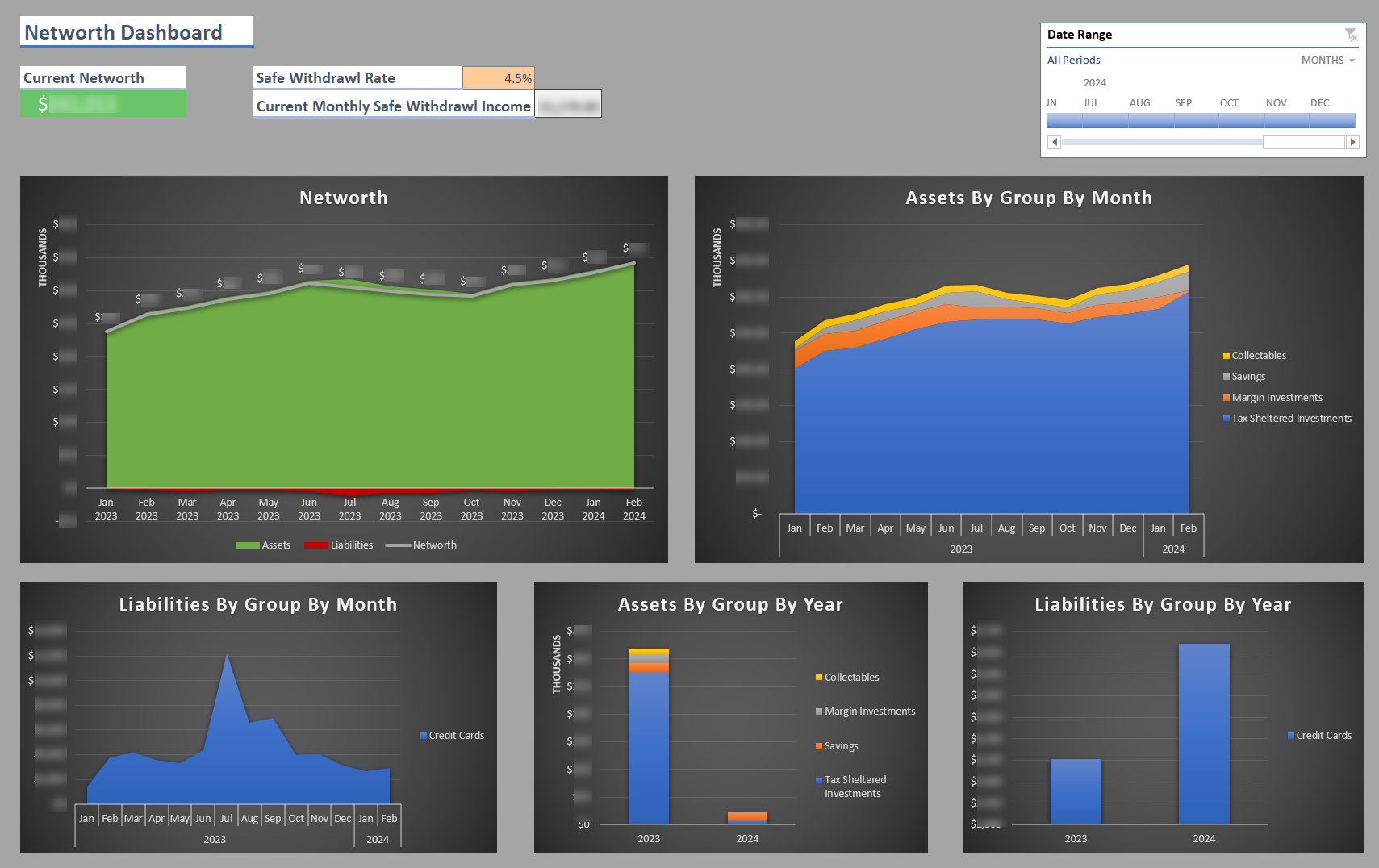
The Networth Dashboard allows you to analyze your assets, liabilities, and resulting networth over time. Use the Date Range timeline to select the date range for the data.
The first Intermediate Sheet Balances by Month uses a combination of pivot tables and standard Excel formulas to summarize the balance history data by month (using the latest balance for each month). It also incorporates the account dimension data (account name, group, class) and calculates other useful information about each monthly balance.
Balances by Month is then referenced by four more Intermediate Sheets: Assets By Month, Liabilities By Month, Assets By Year, and Liabilities by Year. These sheets also use a combination of pivot tables and regular Excel formulas to separate the data into monthly and yearly assets and liabilities organized by group. As with monthly data, the yearly balance data reports the latest available balance for the year. The monthly sheets also perform networth related calculations.
Cashflow Dashboard
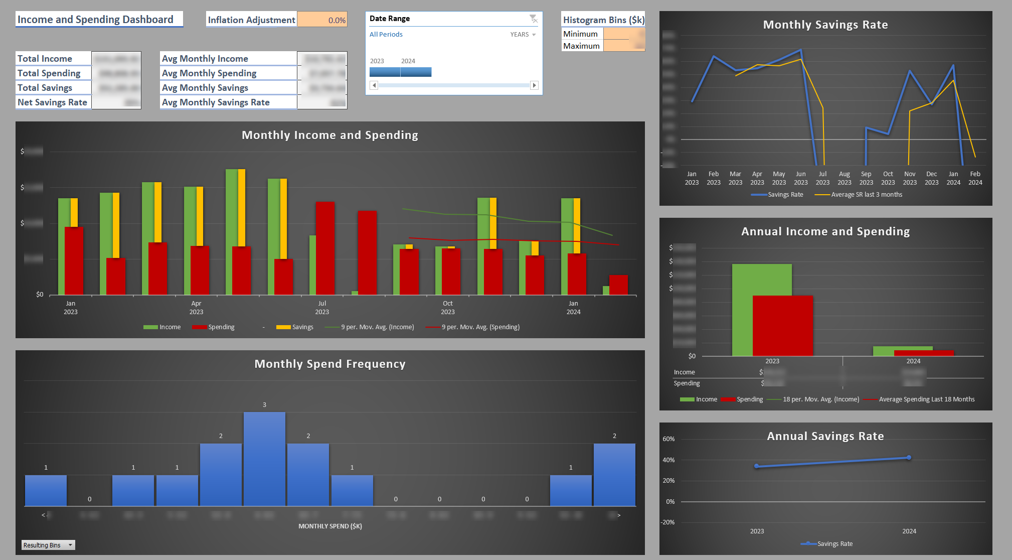
While the spending and income sheets allow you to analyze your income and spending predominantly by categories and groups, The Cashflow Dashboard allows you to analyze your total income and spending over time, your savings rate, and the frequency of your monthly spending via a histogram. Moving average trendlines for spending and income are also included to help identify longer term trends. Use the Date Range timeline to select the date range for the data.
The histogram implementation for this dashboard was created using a custom bar chart rather than the built-in Excel histogram. Use the histogram overflow bin minimum and maximum input cells to define the bounds of your spending histogram. Any monthly spend greater than the bounds specified will be incorporated into these overflow bins. For example, setting the maximum overflow bin to $5000 would mean that any months featuring spend greater than $5000 would all be counted in the column “> $5000”. The bin widths are set to $500 by default. You can see how the histogram is generated in the Income and Spending Monthly Intermediate Sheet.
The figures on this dashboard are inflation adjusted using the Inflation Adjustment setting on the Settings sheet. This adjustment is important when analyzing spending across multiple years, since nominal monthly spend values will give you a somewhat inaccurate picture of how your spending is changing over time. If this adjustment isn’t desired, set the inflation rate to 0%. Any changes to this rate require a data refresh to take effect (see Updating Data).
The Income and Spending Monthly and Income and Spending Yearly Intermediate Sheets contain a combination of pivot tables and regular Excel formulas to aggregate the spending and income by month and year, as well as perform the savings rate and histogram calculations.
Year to Date Summary Dashboard
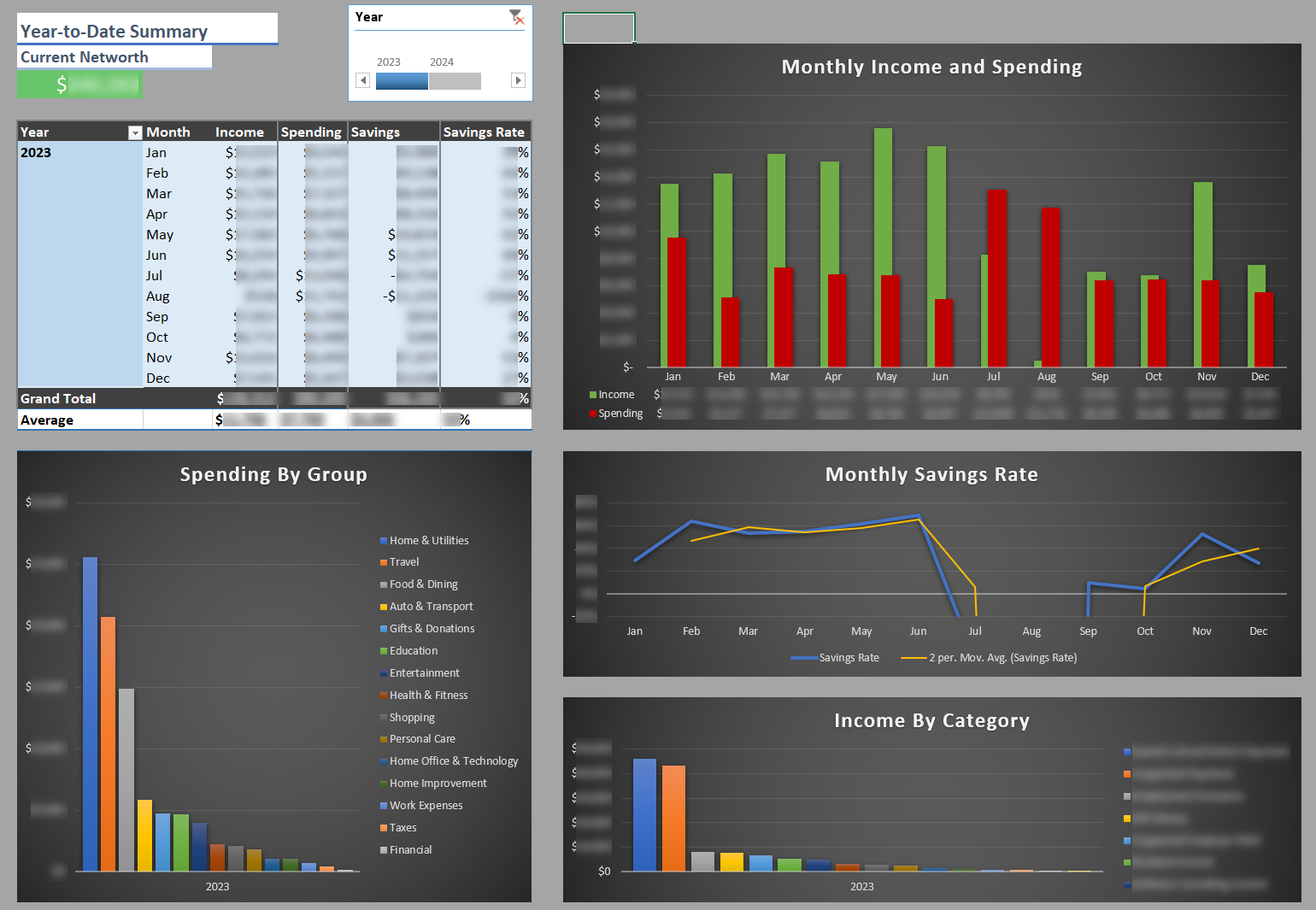
The Year to Date Summary Dashboard allows you to analyze a summary of your year to date finances. It displays monthly cashflow in tabular and chart form, charts of spending and income by category, and a summary of current networth. Use the Year timeline in the top left to select the year of interest.
The Year to Date Summary Dashboard doesn’t depend on any Intermediate Sheets and draws its data directly from the Foundation Sheets.
Cashflow and Networth Summary Dashboard
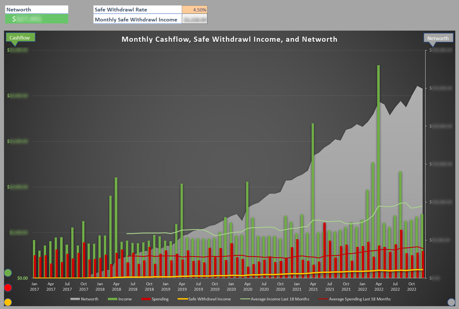
The Cashflow and Networth Summary Dashboard attempts to summarize all of your key financial data and progress towards financial independence in a single chart. This chart features two vertical axes: The left axis displays monthly cashflow (income, spending, and safe withdrawal income), while the right axis displays networth. Moving average trendlines for spending and income are included to help identify longer term trends.
The sheet takes the Safe Withdrawal Rate you set on the Settings sheet, calculates a monthly safe withdrawal income from your current networth, and plots it on the chart. When your yellow safe withdrawal line crosses your red average spending line, congratulations! You’ve achieved Financial Independence.
Use the Cashflow Date Range and Networth Date Range timelines to control the period shown on each axis.
The Cashflow and Networth Summary dashboard draws its data from the Assets By Month, Liabilities By Month, and Income and Spending Monthly Intermediate Sheets.
Tiller Integration and Initial Setup
See Tiller’s Getting Started Guide and Foundations Guide for an overview on setting up Tiller to integrate your accounts with the workbook and set up the Foundation Sheets.
Once you have a Tiller account setup and linked to the workbook, you can import your transactions and account data. Follow the Tiller guides above to fill your workbook using the Tiller Money Feeds add-on.
For non-Tiller users, you won’t be able to link your accounts and fill your workbook using Tiller Money Feeds, but the rest of the information in the guides above for setting up your Foundation Sheets is still applicable.
To import existing transactions and balance history records, you can copy-paste them directly into the Transactions and Balance History Foundation Sheets. Ensure that the data matches the column structure and cell formatting as closely as possible before copying, as mismatches can create problems when refreshing the data.
The workbook initially contains placeholder data in the Foundation Sheets intended to be overwritten with your data. The purpose of this placeholder data is to help keep the workbook in a valid state, as removing all data can cause errors and changes to pivot table configurations. Overwrite and add to this sample data rather than deleting it first to reduce the likelihood of problems. Take extra care not to perform a data refresh when no data is present. If you do, you will likely be better off starting again from a fresh workbook rather than trying to address the issues.
Finally, it’s time to configure your Accounts and Categories. You can verify your accounts are setup correctly by inspecting the Balances sheet.
General Usage
Updating Data
Once the initial setup is complete you can update the workbook periodically with new Transaction and Balance History entries as they come in.
Next, you must categorize your transactions. Follow the guidelines described in the Tiller Foundations guides above. The transactions sheet features validation on the category column which helps prevent invalid categories from being assigned. To reduce the manual effort required for categorization (which, let’s be honest, can be a lot), Tiller offers auto-categorization which can automate repetitive categorization by allowing you to configure rules (e.g. if description contains “x” categorize as “y”). I offer CategorEase, an AI powered alternative which can accurately categorize the vast majority of your transactions straight out of the box. These tools significantly reduce the manual categorization effort required by you. While CategorEase can handle almost all your transactions, I believe there is still significant value in reviewing and reflecting on each transaction individually.
Once all your new data has been added and your transactions categorized, you must refresh all data in order for the dashboards and pivot tables to update.
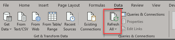
To refresh your data, navigate to the Data tab in the menu and click “Refresh All” as shown below, or press ctrl+alt+F5:
Tagging Transactions
Tags are another dimension you can use to organize your transactions. These could be used for a holiday, a home renovation, tax write-offs, or anything else you want to be able to isolate later. Enter them in the Tags column of the Transactions sheet.
A transaction can carry more than one tag. Separate them with commas:
Wedding, Honeymoon
Spaces around the commas are ignored, so Wedding,Honeymoon and Wedding, Honeymoon mean the same thing.
Two things to keep in mind when naming tags:
- Don’t use commas inside a tag name. The comma is what separates one tag from the next, so a single tag named
Renovation, Phase 2is read as the two separate tagsRenovationandPhase 2. - A transaction can carry up to ten tags. This is a limit of how the tags are split apart behind the scenes (see DAX Calculated Tables).
Tags are rebuilt from your Transactions sheet during a data refresh, so a newly invented tag won’t appear in the slicers until you refresh.
Filtering by Tag
The Spending, Income, Cashflow, Year to Date Summary, and Cashflow and Networth Summary dashboards each have a Tags slicer. Select one or more tags to narrow the dashboard to transactions carrying them; select nothing to see everything. Unlike the Global Exclude Tag below, these slicers take effect immediately without a data refresh.
The Cashflow Dashboard and the Cashflow and Networth Summary Dashboard share a single Tags slicer, so a selection made on one applies to both. The Networth Dashboard has no Tags slicer, since account balances aren’t tagged.
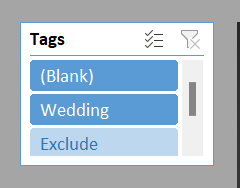
You’ll also notice a (Blank) entry in the Tags slicers. That isn’t a real tag — it stands for every transaction with no tags at all. It’s there so your untagged transactions can be included or excluded deliberately, rather than silently vanishing the moment you touch a tag filter.
A tag that’s currently excluded via the Global Exclude Tag below still appears in the slicers, but with no transactions left behind it.
The Global Exclude Tag
Tag slicers are good for exploring, but they’re configured per dashboard and can easily diverge. When you want to ensure transactions associated with a specific tag are always excluded, use the Global Exclude Tag dropdown on the Settings sheet. This is a great way to quickly exclude transactions from your dashboards and trends. See Excluding Transactions.
Pick a tag and every transaction carrying it disappears from every dashboard in the workbook. The per dashboard Tags slicers carry on working normally on whatever is left.
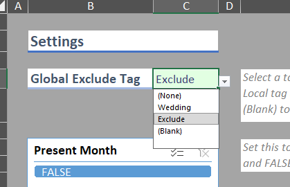
The dropdown offers three kinds of choice:
- (None) — no global exclusion. This is the default.
- Any of your tags — excludes every transaction carrying that tag.
- (Blank) — excludes every transaction that has no tags at all. Useful if you’ve deliberately tagged everything you care about and want to ignore the rest.
Only one tag can be globally excluded at a time, and changes require a data refresh to take effect (see Updating Data).
Excluding Transactions
Often, our financial data contains numerous transactions that we do not want to include in our analysis. The workbook gives you three ways to handle this, from broadest to most targeted:
- Categorize it as a “Transfer”. Any category whose Type is Transfer is left out of the income and spending analysis. This is the right choice for money moving between your own accounts.
- Hide the category from reports. Tick “Hide From Reports” against a category in the Categories sheet to keep it in your data but out of the dashboards.
- Tag it and globally exclude the tag. Best for one-off situations that don’t deserve a category of their own — see The Global Exclude Tag.
Transactions you want to exclude often come in twos (the income transaction and the spending transaction) so make sure you exclude both!
Configuring Moving Average Trendlines
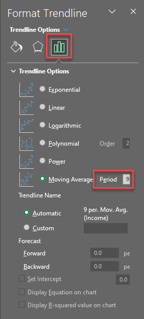
Some of the dashboards feature moving average trendlines to help you understand your data. These trendlines are created by averaging the values over a configurable number of prior periods, and thus may need to be adjusted based on the amount of data you have. As you accumulate more data you will likely want to increase the averaging window to determine longer term trends.
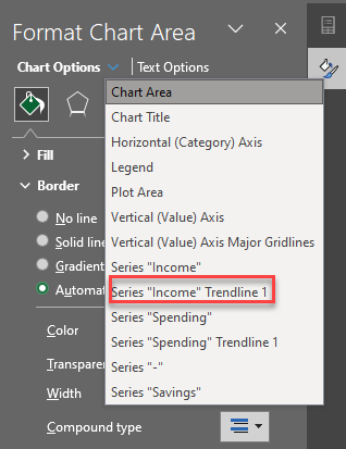
The period over which these averages are calculated can be configured by right clicking on a chart, selecting “Format chart area” and then selecting the trendlines from the chart options dropdown as shown below.
Then, select “Trendline Options” and modify the period as shown:
Troubleshooting
Error Validation
Due to the complexity of the workbook, various sheets include error validation to help prevent issues. Unfortunately, this error checking can’t be done automatically or on the entire workbook in one click so sheets have to be checked individually. To check a sheet for errors, navigate to the formulas toolbar and select error checking as shown below:

If you notice discrepancies in the dashboard, perform an error check on the Transactions sheet to catch invalid categories, then scan the Account ID column of the Balance History sheet for empty cells. A missing Account ID won’t show up as an error but will quietly drop the row from your dashboards, since the workbook builds each account’s unique identifier from it. Fill in any blanks and refresh.

Invalid or Missing Accounts
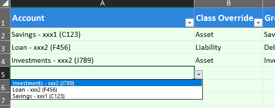
The dropdown that shows up when you try to add a new account is created and validated using the Balance History records. If you are trying to add an account and it isn’t showing in the list, or you have a validation error on an existing account, likely the problem is that there isn’t an associated record in the balance history sheet.
To solve this issue, simply create a balance history record for the account you want to add. It should then show up in the dropdown list and not throw any validation errors.
Missing or Incorrect Data
This can happen for a variety of reasons. I’ve listed some of the common causes and solutions below.
New Tags Not Appearing
The workbook rebuilds its list of tags from your Transactions sheet on every data refresh, so a tag you’ve just started using will only appear in the Tags slicers and the Global Exclude Tag dropdown after you refresh.
If a new tag still isn’t showing up:
- Check you’ve refreshed. Tags are rebuilt during a refresh, not as you type (see Updating Data).
- Check your slicer selections. If you previously selected specific tags in a Tags slicer, that selection is remembered, and a newly added tag won’t be part of it. Clear the slicer filter to bring everything back.
- Check for a stray comma. A comma inside a tag name splits it in two, so
Renovation, Phase 2appears asRenovationandPhase 2rather than the single tag you intended.
Data Refresh Errors
Data Refresh errors indicate an issue with the Excel Data Model or a PivotTable. These can also happen for a variety of reasons. Sometimes the built-in Excel error messages are useful and highlight the exact issue, but sometimes they’re so ambiguous as to be effectively useless. Sometimes, data refresh issues can be solved simply by doing another data refresh!
General Tips
Since these errors often don’t provide any details the only way I’m aware of to resolve them is to methodically narrow down either the change that triggered the error or the specific pivot table / data model table in which the error is occurring and then experimenting with solutions until the issue is resolved.
To address the error by narrowing down the change that triggered it I generally follow these steps:
- Undo the failed data refresh / restore the spreadsheet to a state prior to the error occurring
- Introduce the desired changes to the spreadsheet incrementally, performing a data refresh after each change until the error occurs. This tells you which change caused the error.
- Inspect the change to see if anything sticks out. Things to look for are differences in cell value formatting, missing values, other errors, etc.
- Experiment with different ways of making the desired change, refreshing after each attempt until the spreadsheet refreshes successfully without errors.
To address the error by narrowing down the specific table in which the error is occurring I generally follow these steps:
- Undo the failed data refresh / restore the spreadsheet to a state prior to the error occurring
- Introduce the desired change
- Troubleshoot the Excel Data Model
- Open Power Pivot and the Excel Data Model (see Advanced Functionality)
- Refresh each data model table one by one and see if the error occurs
- If an error occurs, hopefully it provides some information as to what the problem is. If not, inspect the source table looking for differences in cell value formatting, missing values, reference errors, etc.
- If the data model refreshes successfully, you need to start troubleshooting all the pivot tables in the workbook.
- Unhide all Intermediate Sheets containing pivot tables
- Refresh the pivot tables one by one until the error occurs. This tells you that this pivot table is the issue (or is one of multiple with issues)
- Identify the data source of the pivot table
- Inspect the data source to see if anything sticks out. As always things to look for are differences in cell value formatting, missing values, errors, etc.
I’ve done what I can to reduce the likelihood of these kinds of errors but they will inevitably continue showing up due to the limitations of Excel and the approach I’ve taken. As more people use this and run into problems I will continue trying to make the workbook more robust.
Column Contains Blank Values

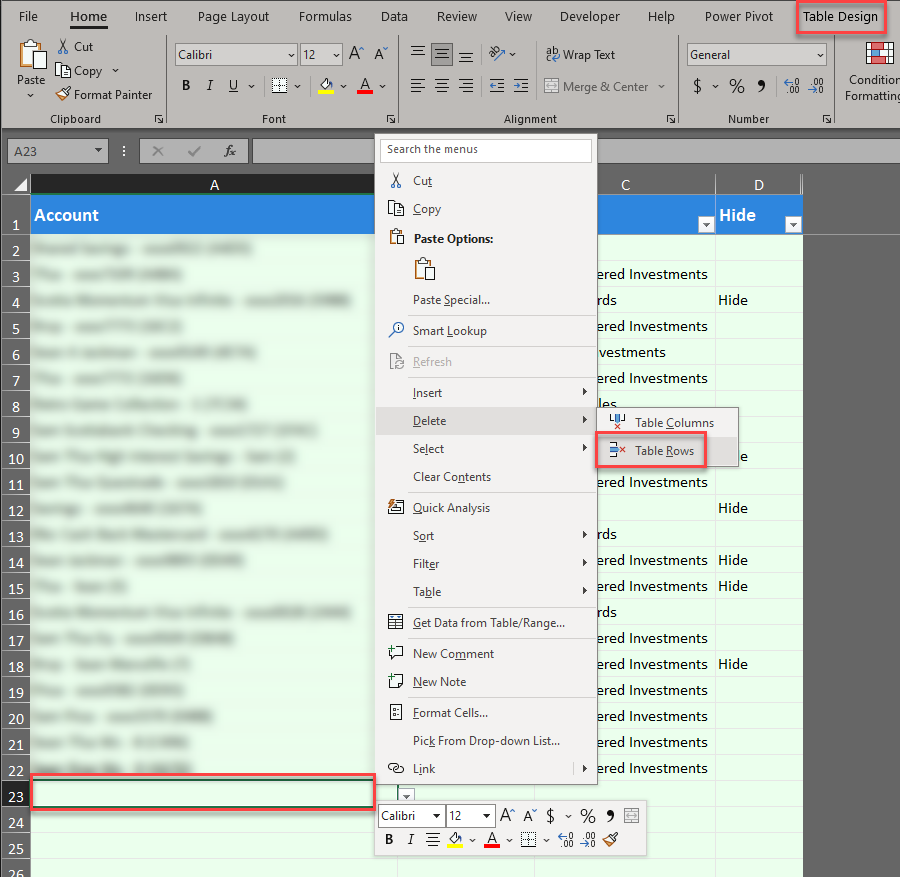
This error will occur if you delete an entry in your Accounts or Categories Foundation Sheets without removing the corresponding table row. Due to the way the data model links the values in these sheets, these tables cannot contain blank values.
To resolve the issue, right click on the empty row (you can tell the row is part of the table if the “Table Design” tab is shown at the top of the screen while the row is selected), hover over Delete, and click “Table Rows” as shown below. You should then be able to refresh all data as usual.
PivotTable field name invalid

This error can occur when data referenced by a pivot table changes in some way. Since the error does not provide any details the only way I’m aware of to resolve this error is to methodically narrow down the issue using the general troubleshooting steps described above.
Advanced Functionality
The following sections describe some of the more advanced functionality behind the spreadsheets for anyone interested in a deeper understanding or who are interested in modifying and extending the workbook.
Power Pivot and the Excel Data Model
The Excel Data Model allows you to conveniently reference multiple tables at once as a single data source. This allows for the creation of pivot tables that can draw data from multiple tables.
When using the Data Model, it’s highly beneficial to have Power Pivot installed. Follow the instructions provided by Microsoft.
Once installed, navigate to the new Power Pivot toolbar and select “Manage”

A window will pop up displaying the tables included in the data model. Alongside the four Foundation Sheets you’ll find five supporting tables:
| Table | Where it comes from | What it’s for |
|---|---|---|
| MasterCalendar | DAX calculated table | A continuous list of dates spanning your data, so months with no activity still appear on charts and balances carry forward. |
| Tags | DAX calculated table | One row per transaction per tag, which is what makes multiple tags per transaction possible. |
| TagsGlobal | DAX calculated table | The distinct list of tags in use, which populates the Tags slicers and the Global Exclude Tag dropdown. |
| GlobalExcludeTag | Settings sheet, cells I4:I5 | Holds whichever tag is currently selected for global exclusion. |
| InflationRate | Settings sheet, cells I12:I13 | Holds your inflation rate. |
The last two are deliberately left unrelated to every other table. They’re parameter tables — a way of getting a single value from a cell on the Settings sheet into a calculation, rather than dimensions you would ever filter by.
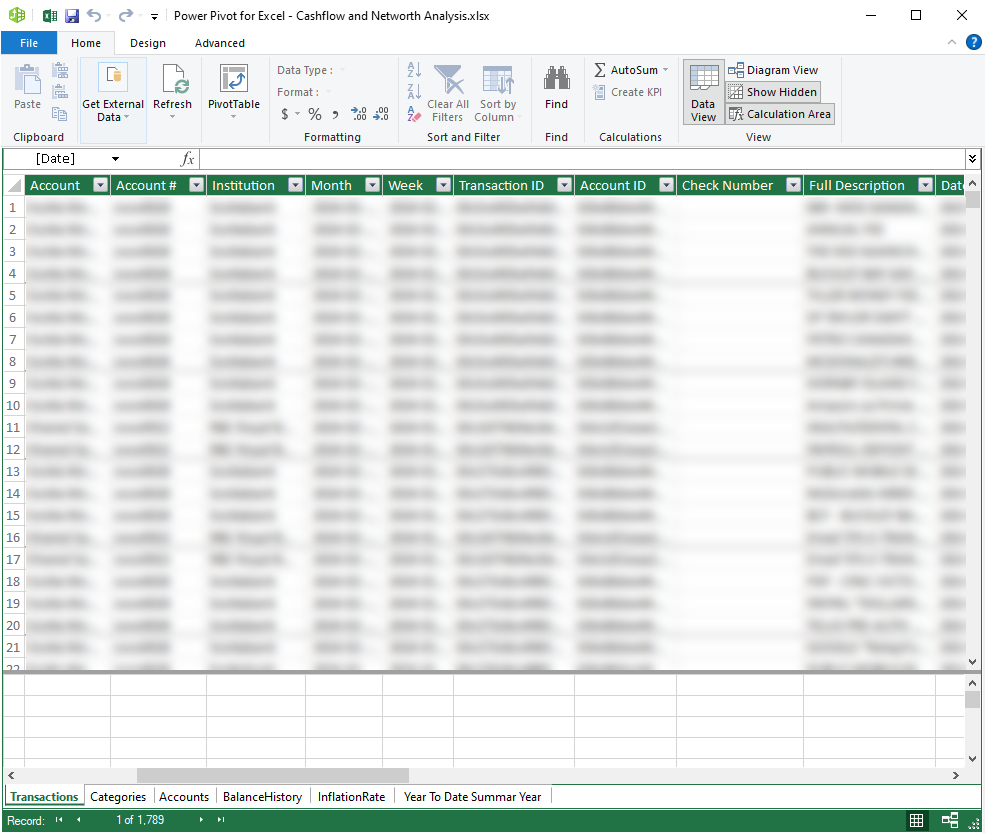
Once added to the Data Model, a pivot table can be created from a data model by navigating to Insert => PivotTable => From Data Model. This pivot table will have access to all the columns in the data model.
The Data Model also provides the ability to add custom columns that can include some basic formulas (unfortunately many Excel formulas are not supported here). This turned out to be the only way I could find to perform calculations on pivot table columns since the standard calculated field feature is disabled when using the Data Model.
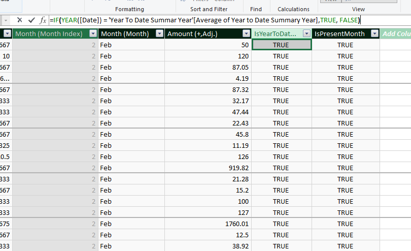
These formulas are written in DAX rather than in regular Excel formulas. The three sections that follow cover the DAX in the workbook: the tables generated by it, the columns calculated with it, and the measures built on top.
DAX Calculated Tables
Three of the data model tables are generated by a DAX query that runs during a data refresh. Don’t edit these tables directly — anything you enter will be overwritten the next time you refresh.
To see or edit the query behind one of these tables, navigate to the hidden sheet containing the table, right click on the table and choose Table => Edit DAX.
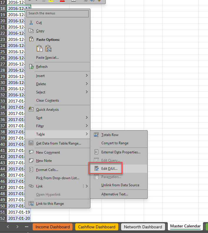
MasterCalendar is a continuous row of dates running from your earliest record to your latest, with no gaps. This is a standard technique for time based reporting. Without it, a month in which nothing happened simply wouldn’t exist in your data and break the continuity of your charts. It also allows account balances to carry forward to months where they weren’t updated, and gives the averaging calculations something to count.
Tags is what makes multiple tags per transaction possible. Excel has no native concept of several tags in one cell: Wedding, Honeymoon is just a string, and a pivot table would treat it as a single value entirely unrelated to Wedding. This table splits that string apart into one row per transaction per tag. It’s also where the ten tag limit comes from, and where transactions with no tags at all are given their (Blank) placeholder so they can be filtered deliberately rather than quietly disappearing.
TagsGlobal is the distinct list of tags currently in use. It’s what the Tags slicers display, and what feeds the Global Exclude Tag dropdown on the Settings sheet.
Calculated Columns
Calculated columns are worked out once during a data refresh and stored alongside the rest of the table’s data. That’s the reason several settings in this workbook only take effect after a refresh: the value has already been baked into the column rather than being calculated as you look at it.
| Table | Column | What it does |
|---|---|---|
| Transactions | Amount(+) | Your Transactions sheet stores spending as a negative number. This flips the sign on anything categorized as an expense so income and spending are both positive, simplifying dashboard creation. It relies on the category’s Type, so a transaction with a missing or misspelled category won’t be classified correctly. |
| Transactions | Amount (+,Adj.) | The inflation adjusted amount, and the core amount nearly everything in the workbook is ultimately built from. It takes the always positive amount described above and incorporates your inflation rate to inflate amounts from the year of the transaction to the current year, so at a 3% rate a $100 purchase five years ago would be expressed as roughly $116 in today’s dollars. |
| Transactions | IsPresentMonth | Flags transactions belonging to the current calendar month. This is what the Present Month setting filters on. |
| Transactions, Balance History | DateOnly | Strips any time component so the date can be matched against MasterCalendar. |
| Balance History | Unique Account Identifier | Balance history records don’t carry a reliable key back to the Accounts sheet, so one is built from the account name, the account number, and the Account ID to mirror the unique account identifier used by Tiller’s Balances sheet. A row with no Account ID gets no identifier, which is why it drops out of the dashboards without raising an error. |
| Master Calendar | Year, Month, YearMonth | Date parts used for grouping and sorting. |
Two consequences of Amount (+,Adj.) being a calculated column are worth knowing. Changing the inflation rate on the Settings sheet does nothing until you refresh, because the adjusted value has already been stored. And since the adjustment is anchored to the current year, every figure in the workbook recalculates on the 1st of January if inflation is non-zero.
Measures
Measures differ from calculated columns in that they’re evaluated on demand, against whatever you currently have selected. Every slicer, filter, and timeline in the workbook feeds into them.
Measures live in the calculation area at the bottom of each table in Power Pivot. Click one to see its definition in the formula bar.
Amount by Tag is the workhorse of the workbook, and most of the pivot tables are built on it. It totals your inflation adjusted amounts while respecting both the Tags slicers and the Global Exclude Tag. Most of its complexity exists to avoid double counting: because one transaction can carry several tags, a naive total would count a transaction with three tags three times over. It also returns a blank rather than a zero when there’s nothing to show, so empty rows drop out of the pivot tables instead of displaying as $0.
Average Monthly Spend drives both the Spending By Group Average and Income By Category Average sheets, despite the name. Working out an average per month sounds trivial until you have to decide what to divide by: twelve is wrong for a partial year, and dividing each row by the number of months in which that particular group had activity would make the groups incomparable. Instead it divides everything by the number of months containing any financial activity at all. Every row therefore shares the same denominator, group averages stay comparable and still add up to the overall average, and a category you only spend on twice a year is still expressed as an average across the whole period rather than across two months.
Leaving the present month in your data drags these averages down, because a partly complete month still adds a whole month to the divisor.
Filtering by tag changes what the number means. The measure divides by the months that contain activity, and selecting a tag narrows that to the months in which the tag was actually used — so a wedding you paid for over four months is divided by four, not by every month in your data. That gives you what the project cost per month while it was running, which is usually what you want. It does mean a tag-filtered average can’t be compared against an unfiltered one, since the two are divided by different numbers of months.
Last Known Balance reports the most recent balance actually recorded on or before the end of the selected period. Without this, a month without a balance history record would show a value of zero rather than its prior month balance (which is a much better estimate).
Average of Inflation Rate simply retrieves the inflation rate you set on the Settings sheet to bring it into the data model.
Data Model Relationships
The data model contains six relationships. All are active, all are many to one, and all are single direction. You can view them in Power Pivot via Design => Manage Relationships.
| Many side | One side | Joined on |
|---|---|---|
| Transactions | Categories | Category |
| Transactions | MasterCalendar | Date |
| Balance History | Accounts | Unique Account Identifier |
| Balance History | MasterCalendar | Date |
| Tags | Transactions | Transaction ID |
| Tags | TagsGlobal | Tag |
GlobalExcludeTag and InflationRate are connected to nothing at all, by design. They exist to carry a single value from the Settings sheet into the calculations, and the measures that need them read them directly.
Single direction means filters travel from the “one” side to the “many” side and not back again. Selecting a category filters your transactions; selecting a transaction does not filter your categories. This keeps refreshes fast and behaviour predictable, and it’s the reason the tag measures are written the way they are — filters flow from Transactions into Tags, so a tag selection has to be applied back to your transactions explicitly rather than travelling there on its own.
Dynamic Chart Ranges and the Name Manager
While Pivot Charts update automatically when their underlying data changes, standard charts referencing a range of cells do not. However, standard charts are much more flexible than Pivot Charts and were required in multiple places in order to display data in the desired way. To enable standard charts to update their data automatically, you can create dynamic formulas to automatically retrieve the necessary data, and then store these formulas in the Name Manager which can subsequently be referenced anywhere in your workbook (including charts!)
You can see all the named formulas in the workbook by navigating to the Formulas toolbar, then clicking “Name Manager”:

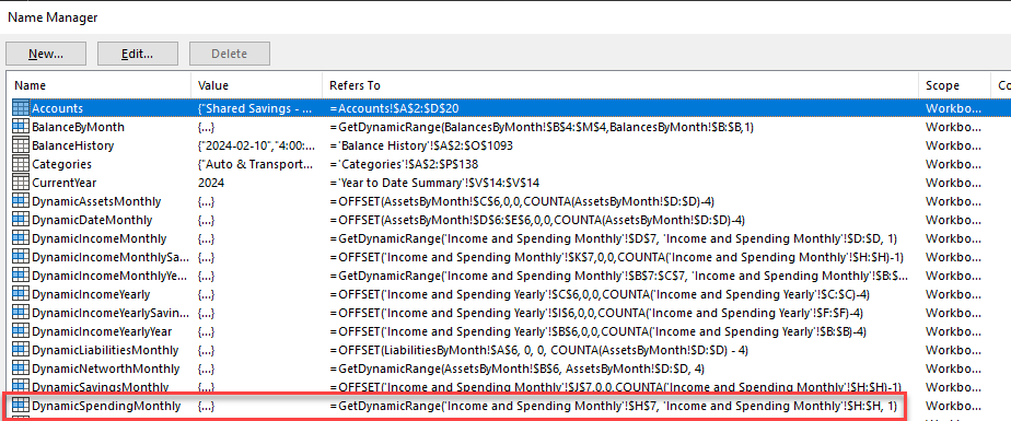
To see how these named references are wired up to the charts, you can right click on a standard chart (you can determine if a chart is a pivot chart if the “Pivot Table Analyze” toolbar shows up when you select it), click “Select Data”, and then edit one of the dynamic data series:
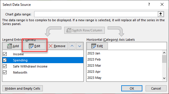
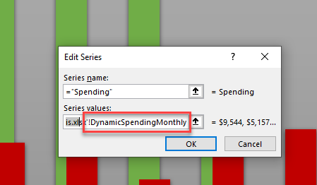
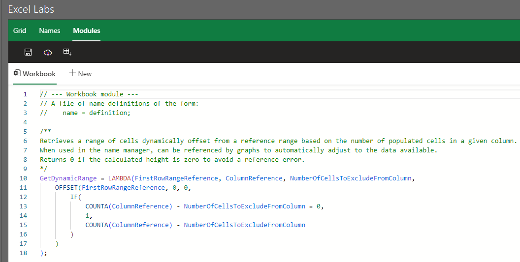
So in the above example, the “Spending” series values in the Cashflow and Networth summary chart is set to ='Cashflow and Networth Analysis.xlsx'!DynamicSpendingMonthly (you also need to reference the workbook when referencing names from charts for some reason). This points to the named reference DynamicSpendingMonthly, which you can see from the Name Manager points to the formula =GetDynamicRange('Income and Spending Monthly'!$H$7, 'Income and Spending Monthly'!$H:$H, 1) (all cell references in the name manager must be absolute references i.e. $H must be used in place of H). Now, there’s still one more layer of indirection: GetDynamicRange isn’t a built in Excel function, it’s a Custom Function.
It’s worth noting that the process of referencing named formulas in charts can be very fussy. For example, Excel will throw an annoying error (which doesn’t even seem legitimate since everything seems to work fine) if you try to reference a name in a chart that refers to anything more complex than a single function (for example, a function multiplied by -1, or two functions added together). Incorporating the additional calculation into the source data to keep the named reference simple resolves the issue.
Custom Functions
Custom functions are extremely useful for reusing complex formulas. There are likely multiple ways to create custom functions, but the method I used was through Excel Labs.
Once installed, you can open the Excel Labs pane by navigating to the Home toolbar and clicking Excel Labs on the far right:

From here, select “Modules” to see the GetDynamicRange custom formula:
Troubleshooting Dynamic Charts
Despite my best efforts, I still occasionally find issues with the dynamic charts in the dashboard sheets. Often these are due to small changes in pivot table filters which can mess up the dynamic range formulas described above. These formulas determine the cells of interest by looking at the number of cells in a column containing values minus a manual offset, so if you add a new cell containing a value to said column (like a new pivot table filter) then you need to subsequently increase the offset. To help troubleshoot these issues, each dashboard features a hidden table depicting a mirror of the formulas used to generate the series values. The table displays the formulas used by the chart and their results as shown below:
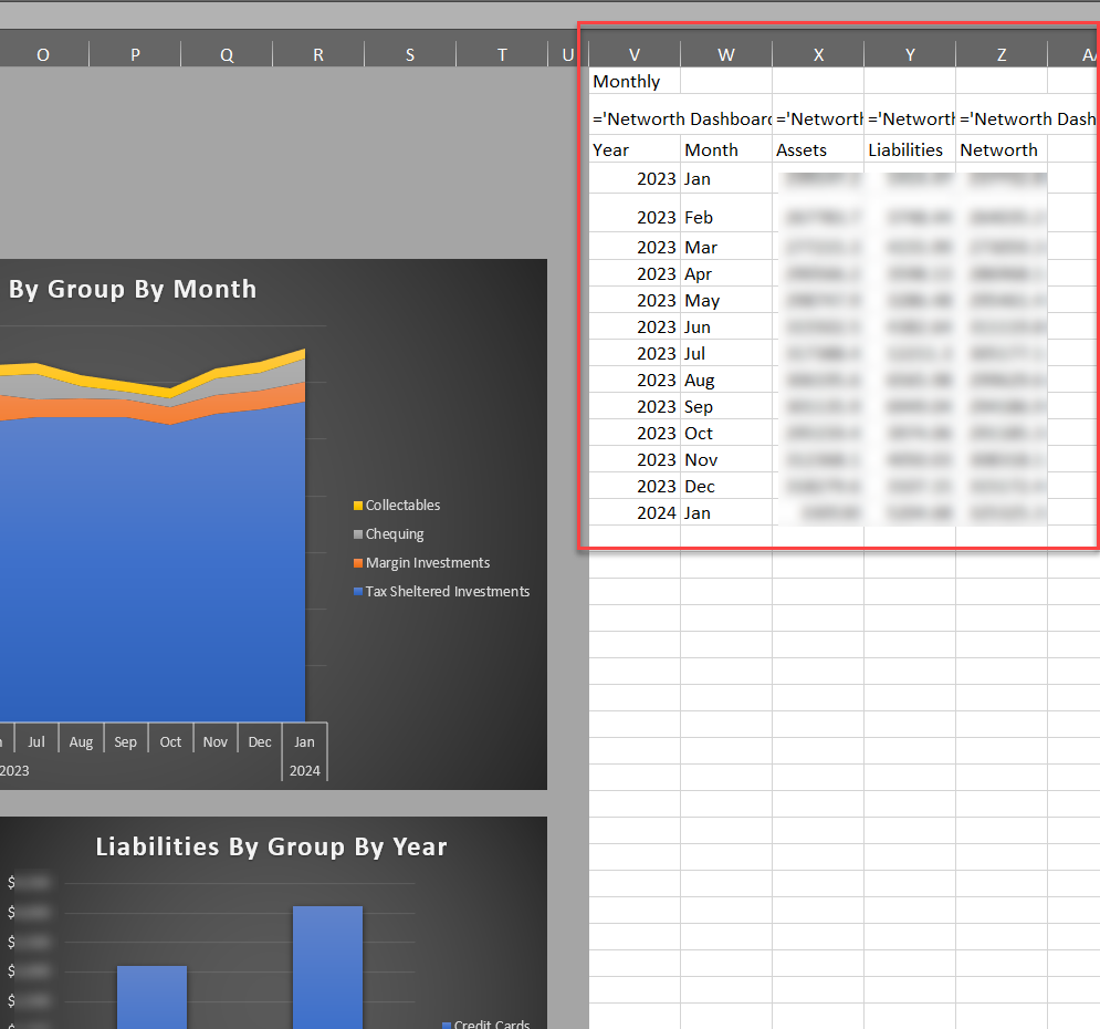
This makes it much easier to identify inconsistencies in data and which formula and underlying Intermediate Sheets are creating the issue. To see these tables, simply unhide the columns to the right of the gray sections of the dashboards and re-hide them when you’re done.